Recruiter Dashboard
Background
Stepstone Group is a leading international brand which owns job sites all over the world. It’s currently active in over 22 countries. Totaljobs is one of its brands and has an extremely large presence in the UK.
The Challenge
The challenge was to create a new, harmonised dashboard experience that addressed recruiter needs and surfaced next-best actions after login. This solution would serve both Stepstone and Totaljobs, ensuring a scalable, global approach that could be applied across brands.
My Role
- Lead Product Designer
- Worked in a cross-functional team with a PO based in Germany, developers based in Poland and GTM in London
Results
63% decrease
in admin and account related calls
2.4% increase
in retention
Introduction
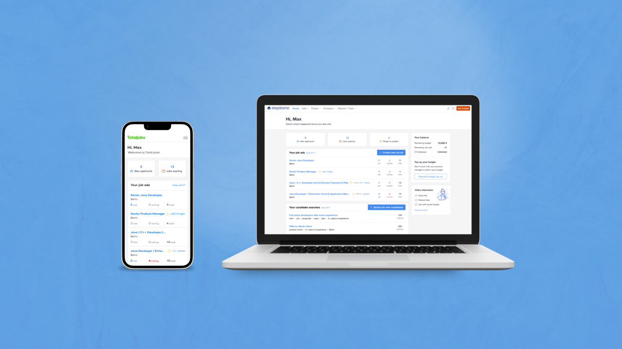
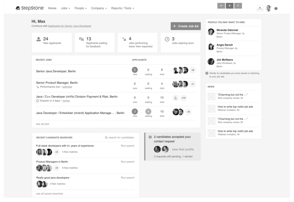
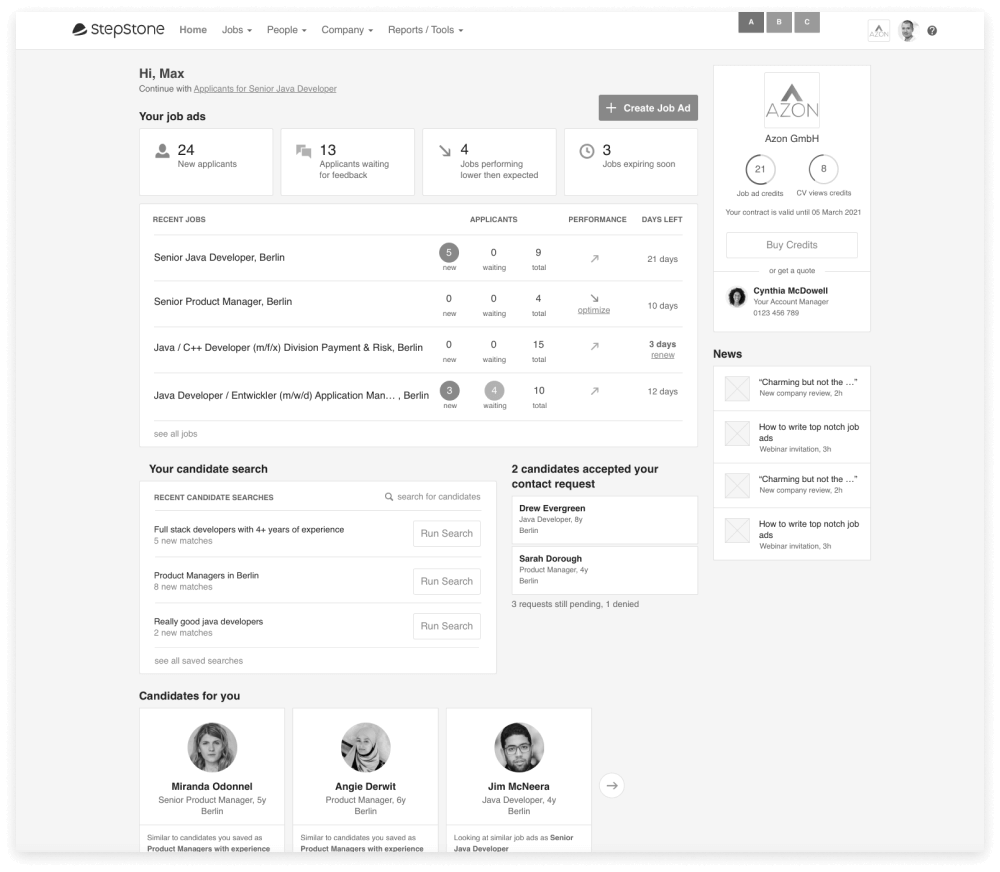
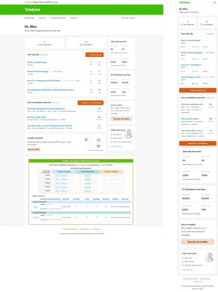
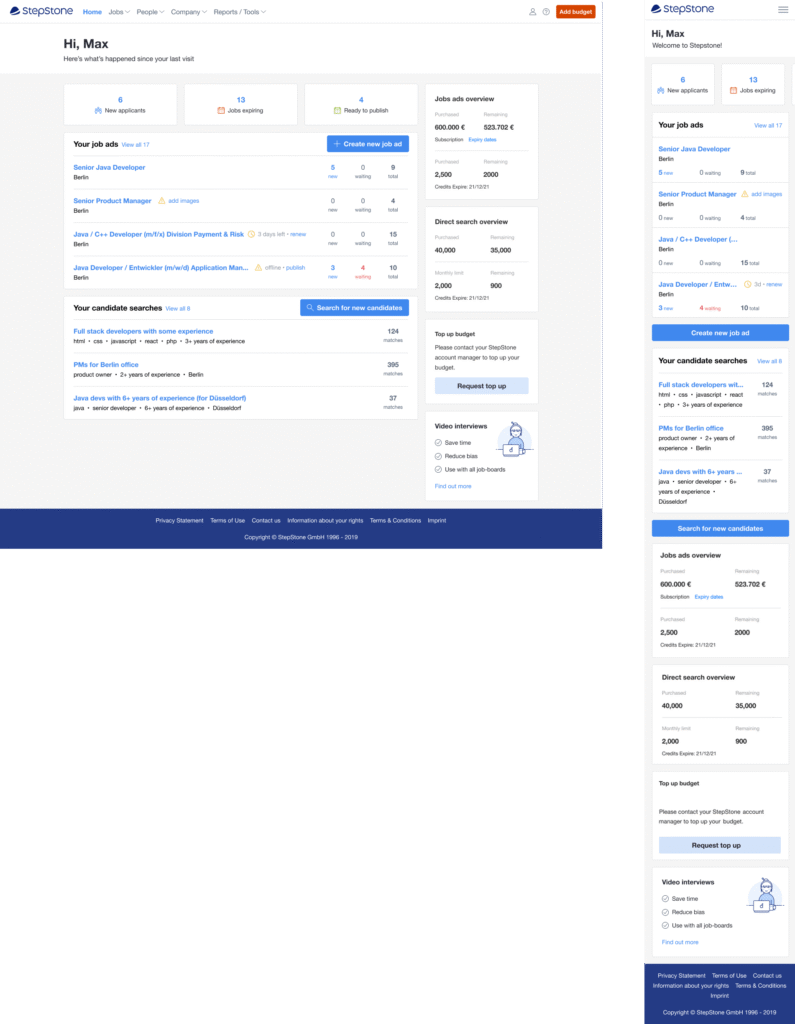
At Totaljobs the first place users land after logging in is the dashboard, while at StepStone it’s the List of Listings (list of all posted jobs). StepStone doesn’t have a dashboard and the Totaljobs one was old, extremely outdated and not responsive.

Old Totajobs dashboard
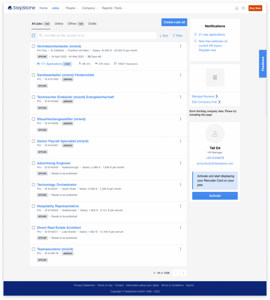
Old Stepstone list of listings page
Research and Discovery
Through interviews and workshops with recruiters, customer success agents, and the sales team, we discovered core user goals:
One
Monitor job performance and optimise listings
Two
View application statuses quickly
Three
Track saved CV searches
Four
Check account balance and contract usage
Additionally, internal teams like customer success use the dashboard as a reference tool when speaking to clients, meaning data accuracy and clarity were paramount.
We formed two hypotheses:
One
An improved dashboard would reduce administrative support calls by surfacing clearer, real-time job and application data.
Two
A modernised experience would reinforce product value perception and drive customer retention.
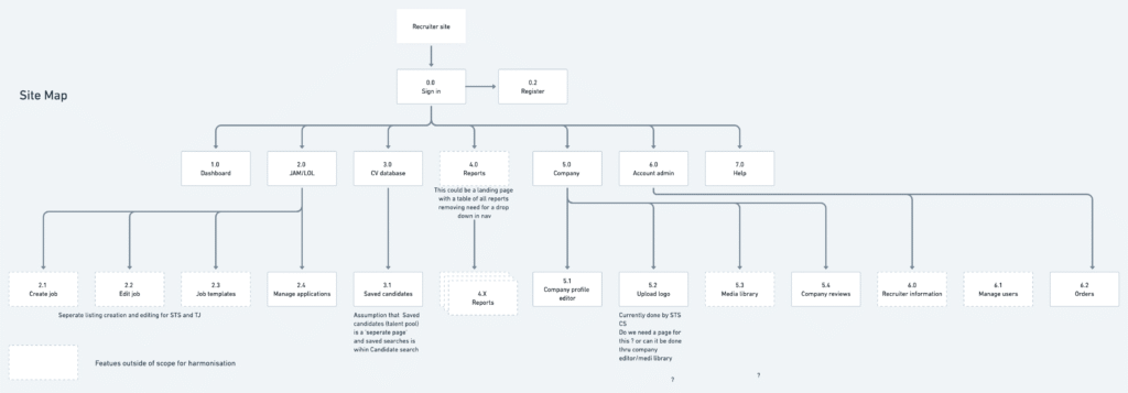
I began to map out the current site architecture for both Totaljobs and Stepstone to ensure all parts of the journey were taken into account for the redesign. There was an initiative to harmonise the navigation in a separate project, however I felt it was best to tackle some of this in the dashboard project as it would help to create a holistic solution.
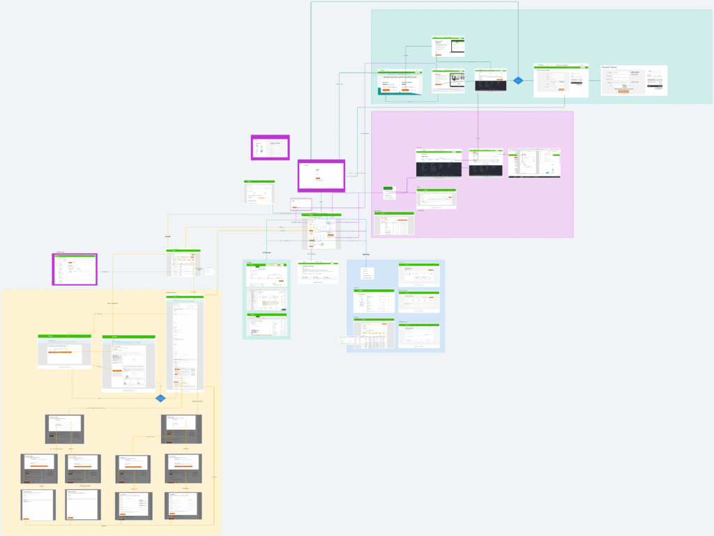
Totaljobs site architecture
Stepstone site architecture
Navigation Analysis
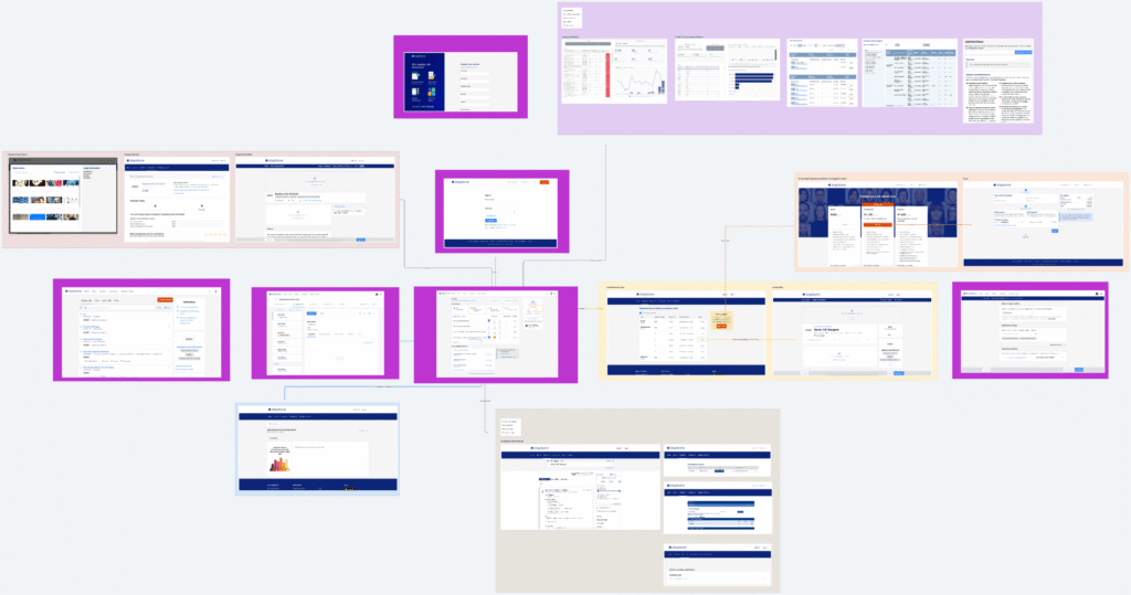
We mapped and compared the current user journeys across Stepstone and Totaljobs. We conducted a workshop to co-create a harmonised navigation model that would inform the foundation for future A/B testing.
Proposed harmonised navigation
Ideation
Using the research insights, I explored multiple dashboard concepts aimed at:
- Reducing cognitive load
- Surfacing meaningful metrics at a glance, such as job performance, optimising listings, number of applications, saved cv searches and account information
- Next steps, or next best action to optimise jobs or respond to applicant
I worked closely with the cross-functional team to validate design assumptions and test early concepts with users. Recruiters appreciated clarity, but early versions were still too busy. Users struggled to identify the dashboard’s core purpose and locate key sections when prompted. This highlighted a need to reduce cognitive load and simplify the layout.
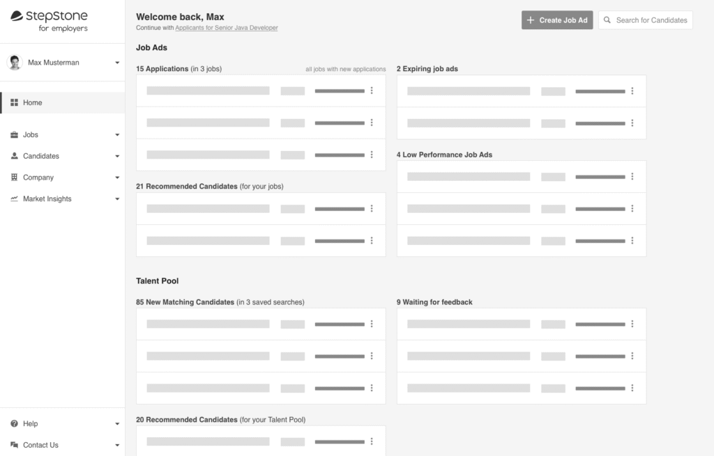
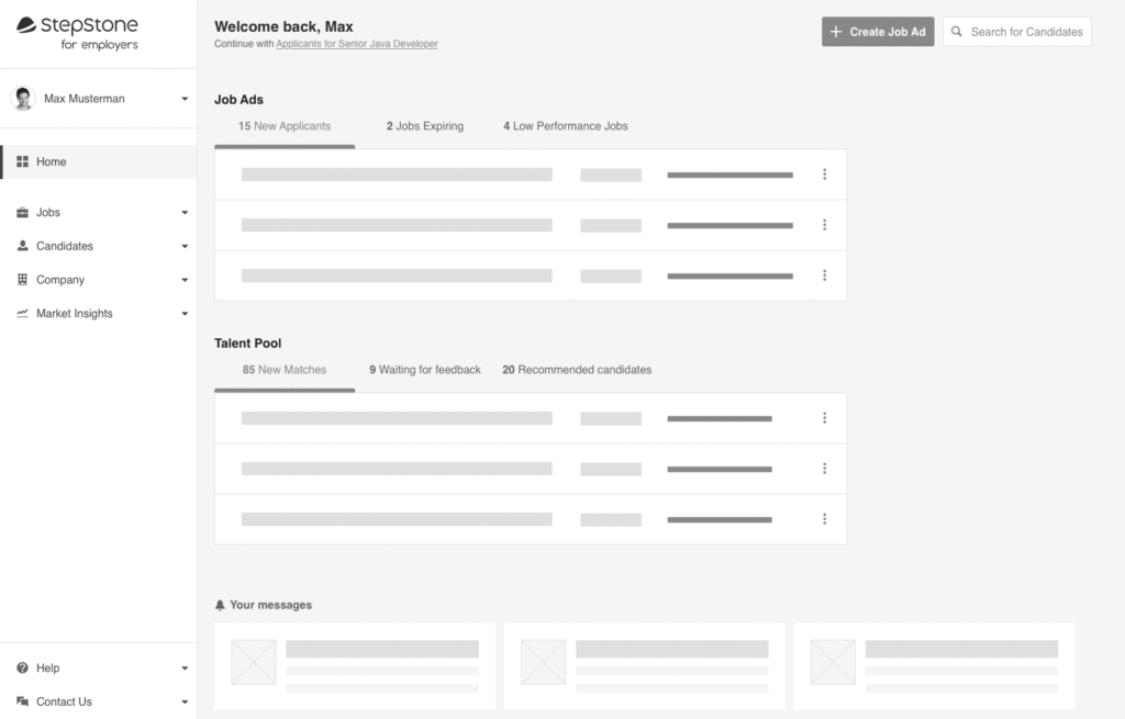
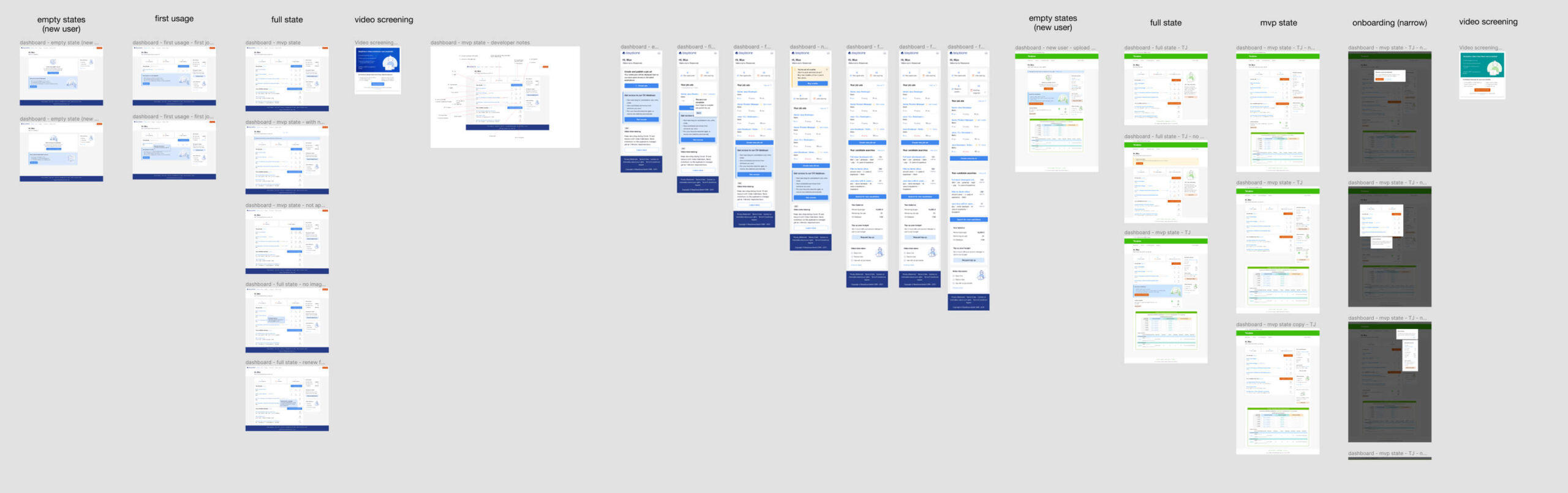
Validation and iterations
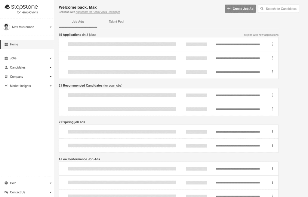
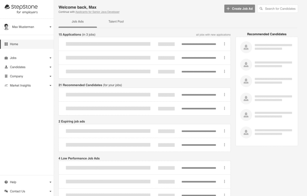
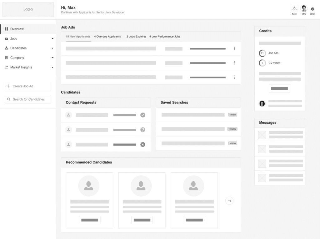
Based on those insights, I refined the layout to emphasise hierarchy and clarity. We then tested the updated versions, and one layout stood out for its clear visual structure, quick scannability, and focus on application activity.
Updated ideas that were tested with users
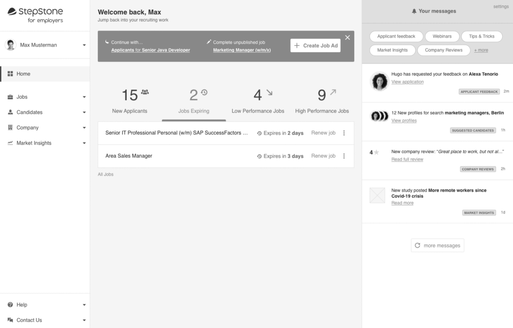
Dashboard version 1
Dashboard version 2
Dashboard version 3
We ran usability tests to validate wireframes with both Stepstone and Totaljobs users. The highest-performing version presented:
- Clear visual hierarchy
- Application activity front and centre
- A dedicated section for expiring jobs and unread applications
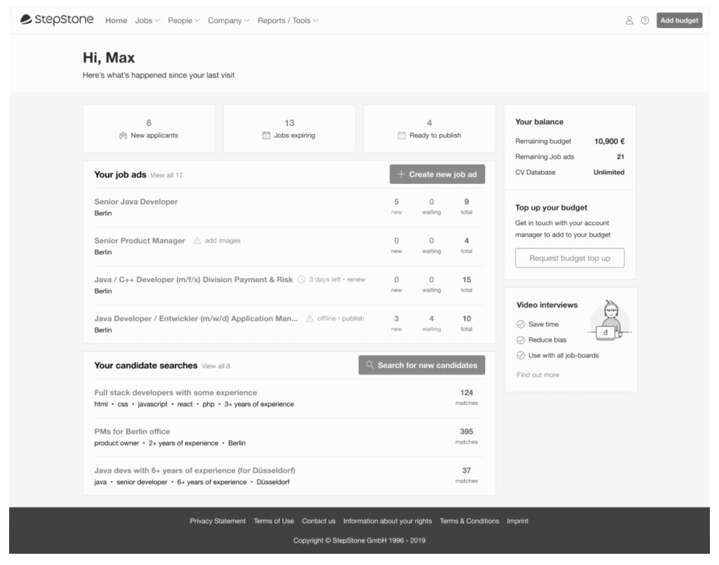
Solution
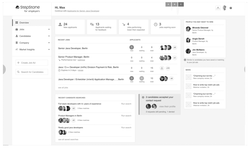
I created hi-fidelity designs for the different use cases for both Stepstone and Totaljobs and a prototype to ensure developers could see the user journey for each use case.
Post Launch Feedback
After release, administrative call volumes dropped and qualitative feedback was positive. However, a new insight emerged: users struggled to interpret account overview data, especially around contracts and subscription models.
After speaking to customer services and our users to better understand the problem we re-tested the widget with updated layouts, eventually separating Job Ads and CV Database views and aligning labels more clearly to the numbers. This change significantly improved user comprehension.
Results
Not long after the dashboard was released we saw an increase in usage, which continued steadily throughout the year.
-63%
Support Calls Reduced
+2.4%
User Retention
Key Takeaways

A harmonised, insight-driven dashboard increased transparency and reduced support dependency
Recruiters are now presented with clear hiring performance indicators and actionable next steps
Aligning with jobseeker pain points with an improved feedback loop between candidate and recruiter.