Application Manager
A brand new application management tool
Background
Application Manager is a tool used by recruiters to review, manage, and progress applicants through the stages of the hiring process. It handles large volumes of candidates, often across a wide range of job types; from high-volume roles to highly specialised positions.
The Challenge
To design a responsive application manager that allows small to medium businesses to quickly sift and sort through job applications and progressively applicants through the hiring process.
My Role
– Lead Product Designer
– Embedded in a multi-disciplinary squad for the recruiter domain. Which included a Product Owner, 4 full stack developers.
Results
508%
increase in engagement
14.1%
increase in mobile adoption
11.7%
increase in customer retention
At The Start
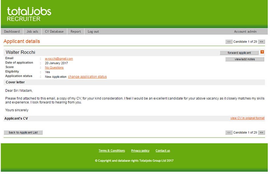
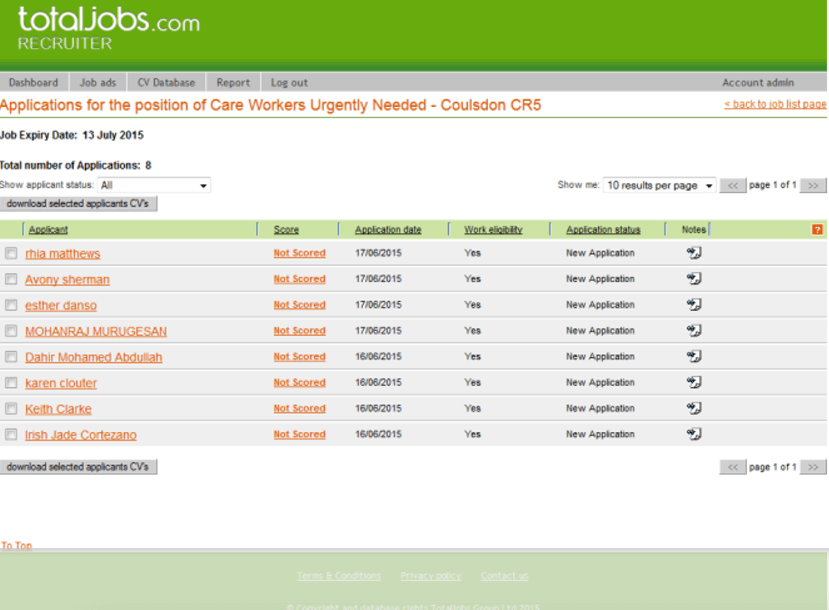
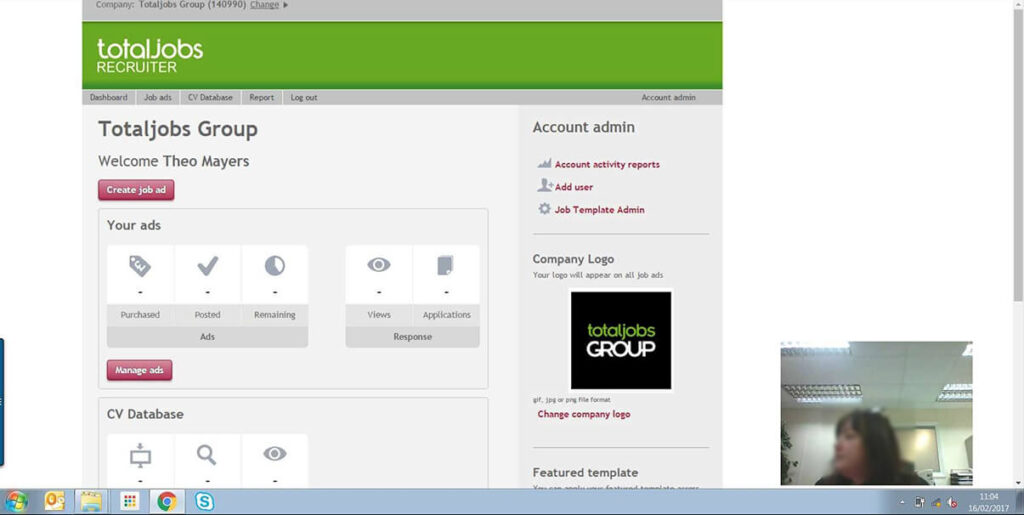
We already had an application management tool in place, but it wasn’t fit for purpose. It was outdated and difficult to use across devices. Recruiters found it slow and clunky, which led to a noticeable drop-off in the hiring journey. This wasn’t about launching something new, it was about rebuilding from the ground up. Our goal was to create a modern, responsive framework that worked seamlessly across all verticals, meeting the real needs of today’s recruiters.
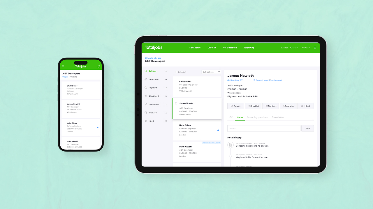
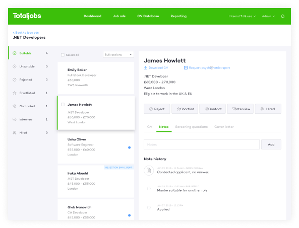
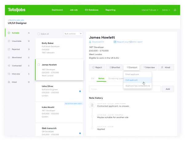
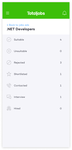
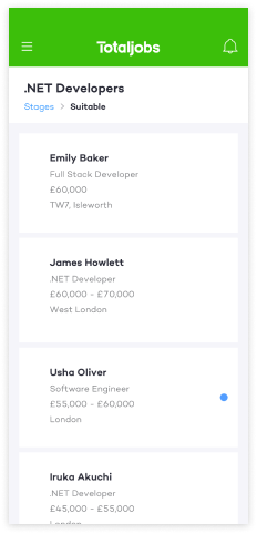
List of applications in application manager
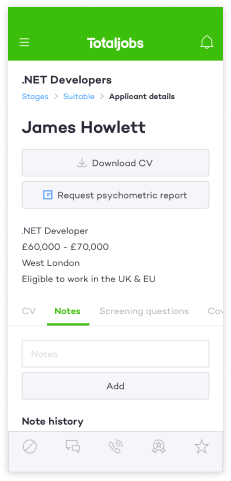
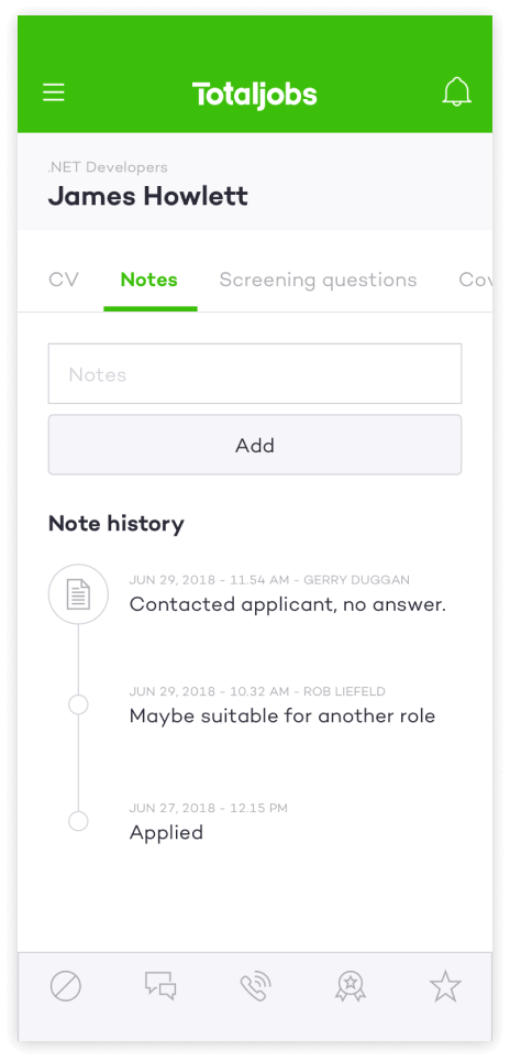
Application details
Strategic Approach
Discovery
A user-centred design process shaped every decision—balancing recruiter needs with business goals like retention and mobile usage. It also allowed us to foster strong cross-functional collaboration and kept stakeholders aligned from start to finish. We used the following discovery methods to gain a better understanding of the current experience and our users.
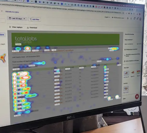
MouseFlow

Adobe Analytics

Indepth Interviews
Key Findings
Key capabilities designed to streamline recruitment.
Drop off on key pages
28% of users reach Application Manager, only 7% view Applicant Details.
Checkbox usage confusion
Misinterpretation of bulk action functionality. 22% clicked on checkboxes, but only 2% downloaded CVs.
Unexpected entry points
The majority of users enter Application manager directly from a confirmation email
Recruiters workflows
Recruiters first pass is to sift and sort applications, after that the hiring process hiring is not a linear process.
Inbox As A Mental Modal
Email was the main tool used throughout the hiring process.
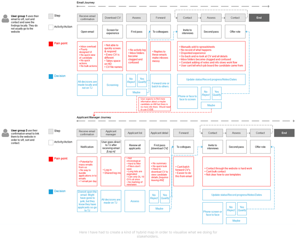
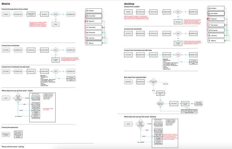
To fully understand and document the recruiters workflow and frustrations, we created a customer journey map of the two main workflows.
1. Email Journey
The entire hiring process is managed using the recruiters inbox.
2. Applicant Manager
The journey starts from a confirmation email, but the process is handled using applicant manager.
Design
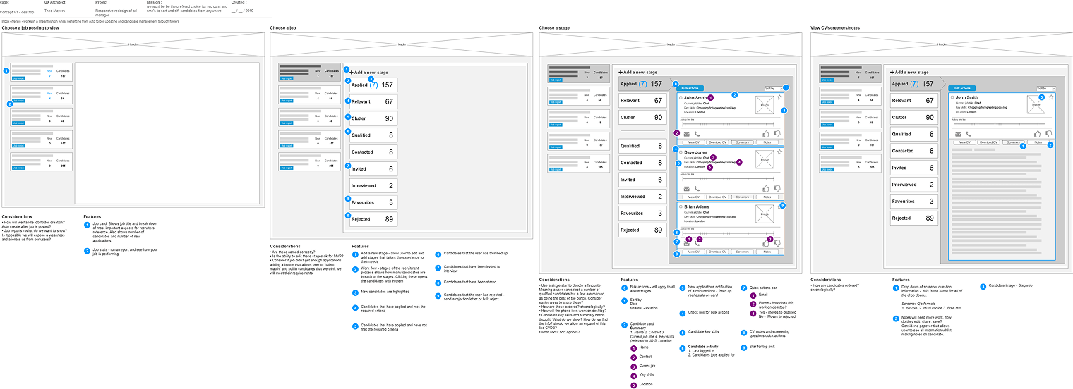
Collaborating with our cross-functional team, we explored ideas, prototyped, and tested to create a solution that met user needs.
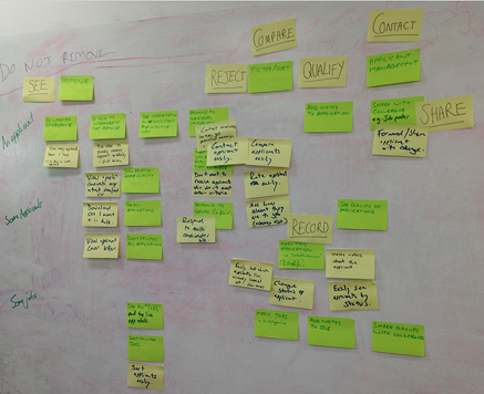
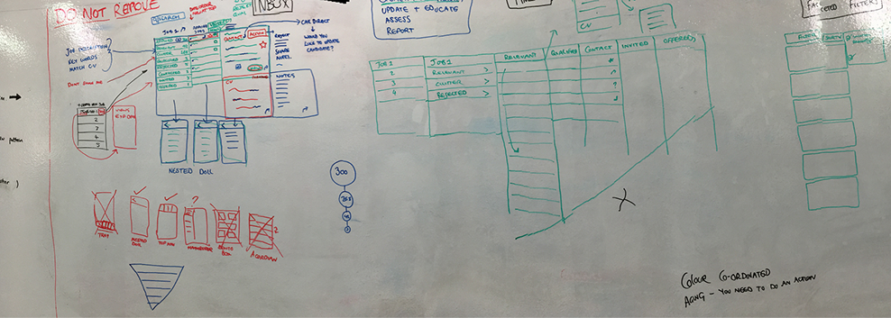
Mapping out task flows and how applicants move between stages of the hiring process.
Wireframes and Prototypes
I wireframed and prototyped the ideas from the co-design session with the cross functional team to test and validate with users.
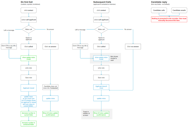
Testing and Iterations
I tested the prototype with recruiters and gathered feedback from stakeholders throughout. Their input shaped several key iterations:

Renamed workflow buckets
This was to match the recruiters’ mental models and terminology.
Refined logic for applicant movement
between stages to better support non-linear workflows.
Redesigned applicant overview cards
to improve scannability, this helped recruiters to quickly decide whether to view candidate details.
Added smart filters
(e.g. right to work and valid driving license) enabling automatic bucketing of unsuitable candidates. Later this included the implementation of screening questions to further assist recruiters.
Adopted an inbox style UI
this was already family to our users and helped speed up triage and reduce friction.
Continuous User Feedback
We implemented a lazy load feature after discovering users felt that content wasn’t available to them when it loaded slowly from our servers.
Solution
Once the designs were complete for all verticals and all view points it was time to complete build and start an alpha release to small numbers of sympathetic users. We used trusted clients and our original testers to give feedback when using the product in the real world. This helped to clear up any teething issues in a safer environment.
Impact
It took more than a year to release version one of the responsive applicant manager. Straight after release we saw a sharp upturn in people using the platform and a huge increase in those using on mobile and tablet, which was a primary KPI. The trend continued as time past and this is the real success. When released we sent out email campaigns and talked to clients about the new back office which accounted for the quick upturn, but the fact they stayed and continued to use it shows we made a quality, usable product.
Key takeaways
Before responsive applicant manager was released we saw approximately 60,000 visits on desktop to the applicant manager. After the release of the new responsive applicant manager we saw the following results:
130K
visits per month
After the second month of release
365K
visits per month
On desktop in July, the year after
508%
overall usage
Increase in 15 months
Mobile usage saw similar gains but on a smaller scale. Long term analysis showed that most recruiters managing their jobs and applicants at their desks during working hours. We saw an increase in mobile usage during morning and evening commutes. Tablet usage went up in the evenings this suggests users sat in the evenings on the couch assessing candidates before work the next day.