Ecommerce site redesign
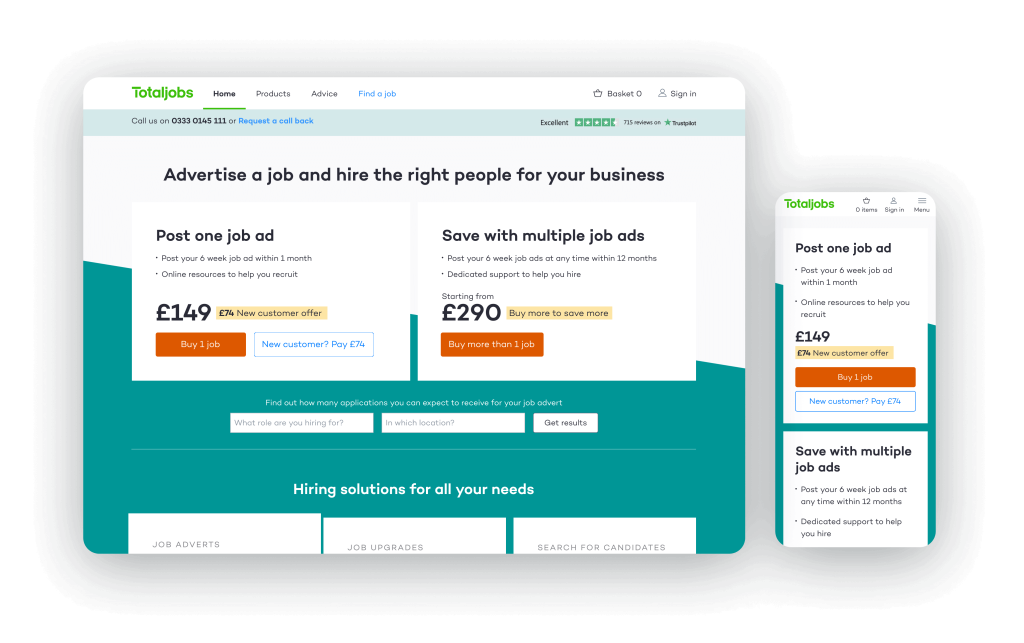
The Totaljobs recruiter site is the core part of a prospects journey. Here we identified that users could be in the discovery phase so the company proposition needs to be clearly communicated. We may be welcoming returning customers so the purchase options also need to be clearly labelled.
There were many assumptions floating around with in the business, these include:
- we’re losing out to our competitors
- users didn’t understand the variety of products we offered
- Product discovery was difficult because everything was put under “Advertise a job” or “Find candidates” navigation items.
- users didn’t know what our products looked like
- users didn’t know what to expect from our products
Discovery
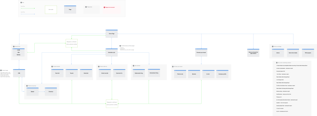
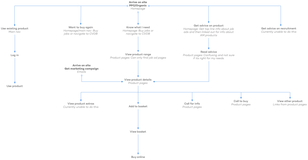
The first step in this project was to understand how the current site was working; the flows in and out, tasks being performed, and to understand the types of people using it.
Using hotjar I discovered the needs boxes were not getting any engagement. Adobe Analytics showed those users who clicked on the needs boxes, then click straight back to come to the home page. This was the same behaviour for the “Managed Services”, maybe it was too early to surface this, especially for prospects in the discovery phase.
I conducted an online survey, which furthermore confirmed some of our underlying assumptions. The results suggested that 54% of users didn’t understand our product offering, didn’t know what our end product would look like or what to expect as an outcome.
I also interviewed some of our users. The users were made up of
- Small business owners
- HR professionals
- Recruitment consultant
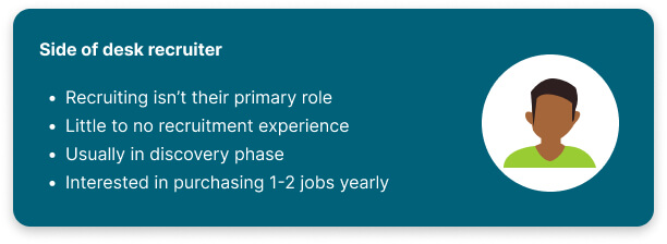
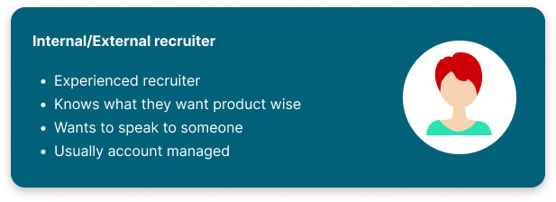
The interviews were really insightful, it also validated the three proto personas we’ve always spoken about within our working group. It was clear that we would have to consider these personas for the redesign, regardless of the business type.
Through the various research methods I discovered
- Talk to us boxes we’re getting no engagement
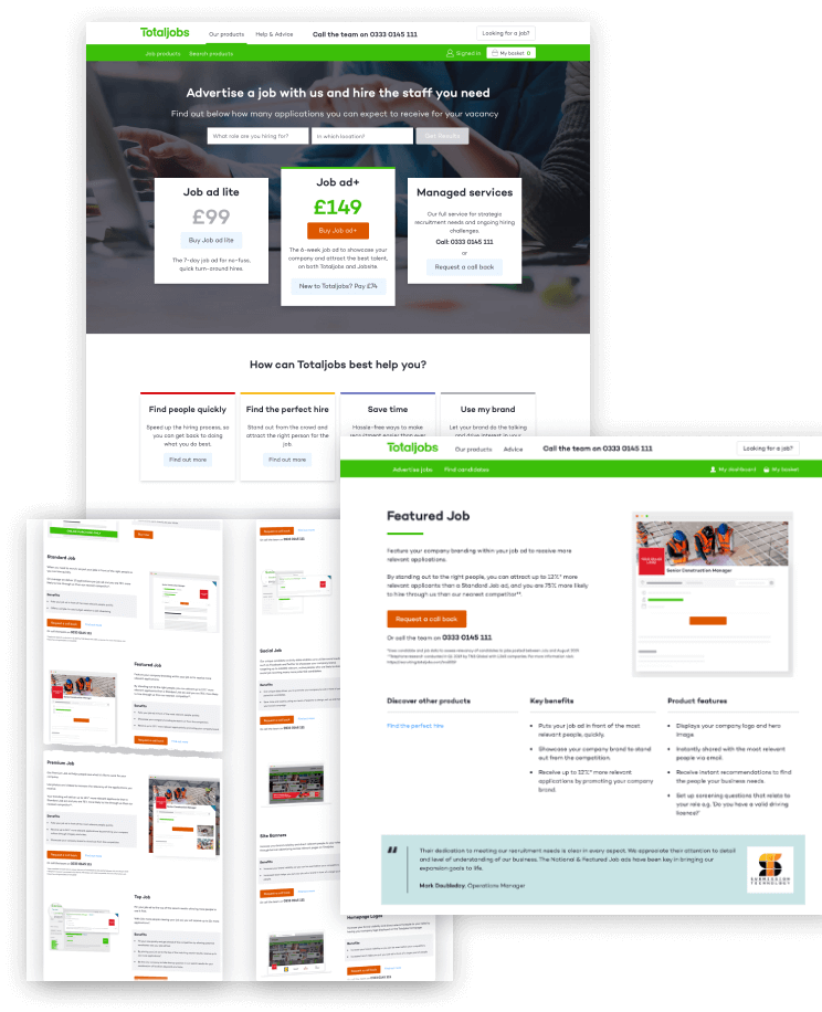
- Confusion about our products as they were all under one section called “Advertise jobs”
- Find candidates was being mistaken for login and using the cv database service
- The needs boxes we’re confusing as there was a lot of cross over
- Confusing content – too much jargon
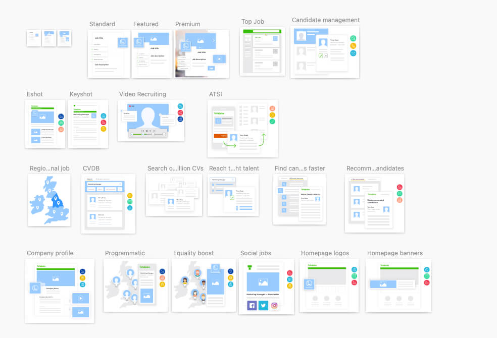
product images needed work
Proto-personas
Ideation time
Product page
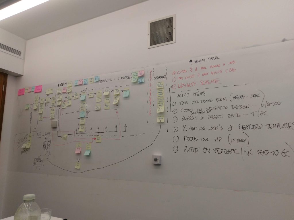
I facilitated an ideation workshop with the Ecommerce Lead Generation team as they wanted more input and visibility of redesigning the product page.
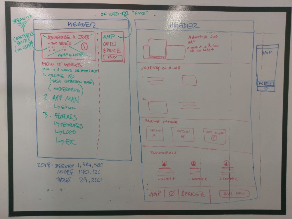
I presented our current assumptions and insights we gained through the various research methods. I coordinated a crazy 8s exercise where everyone was involved. I then got everyone to talk through their 8 ideas and we all dot voted. We then put together parts/sections for the page from the top voted designs. This was a great way to align everyones thoughts and ensure all direction was based on our research and insights.
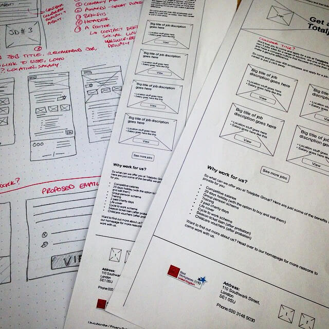
Home page and other pages
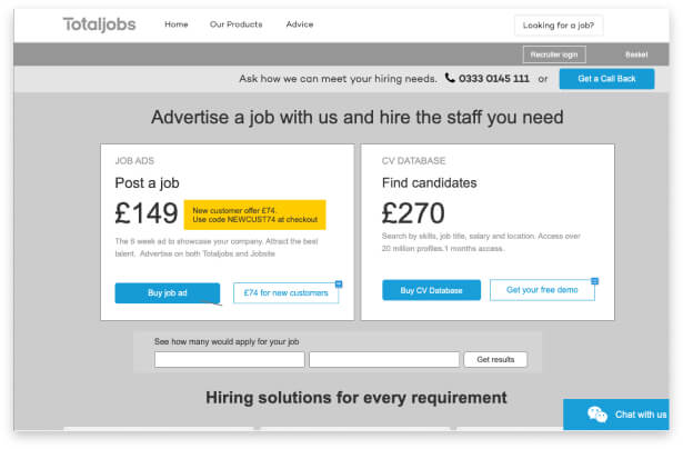
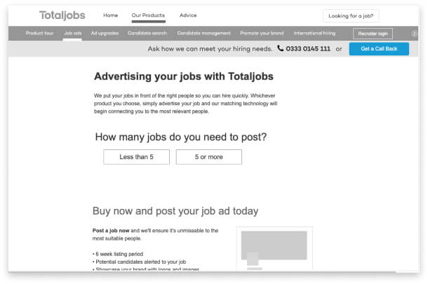
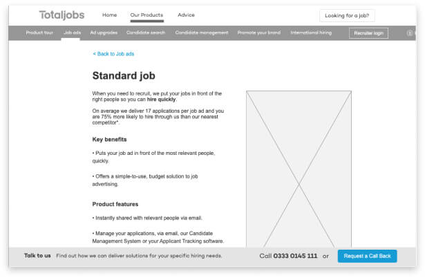
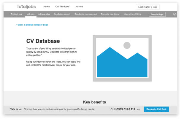
Working closely with stakeholders I digitised the sketches and created wireframes in Axure for each of the pages. The low fidelity prototype also showed the new product groups, IA and taxonomy. I went through the content and suggested new copy as our research showed the existing content was confusing. I also worked with a copywriting agency to ensure we used the optimum copy to test with our users.
Usability testing
I spoke to some of our clients to see if they would be interested in being apart of our site redesign and recruited the participants. We tested the low fidelity prototype focusing on the homepage, product pages, content and navigation.
Participants were asked to imagine being a prospect. Whilst free roaming the prototype they were asked to give impressions of Home Page, Product pages and Content that they were interested in and what steps they would take next.
Testing summary
- The experienced recruiters preferred to telephone or use chat discuss the products with an account manager, while only browsing content to ensure the product offering was present.
- All participants rated the revised content as being easier to digest and understand than the current live page.
- Only the side of desk recruiter felt the need to drill down to product details page.
- All participants would like to see more engaging illustrations of the products.
- Consider personalising the HP to the recruiter needs, currently its more ecomm focused rather than account managed.
5 second test
I worked closely with our digital design team and provided direction on redesigning the product images. We then put these in front of our users using the 5 second test on usability hub. Each participant was shown the image for 5 seconds and then had to pick from a list what the image was trying to communicate.
The solution
Overall the feedback was positive, we proved the new copy was better and that the product images needed to be updated. I then proceeded to work on the visual design and applied the new branding to the wireframes.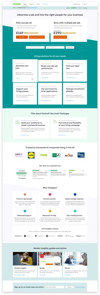

Key takeaways
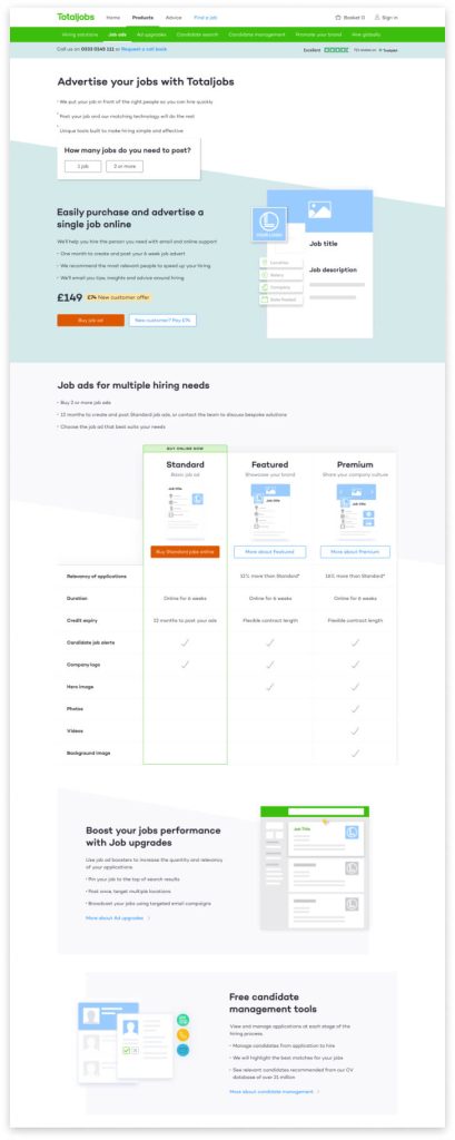
Totaljobs now has a new home page that clearly communicates our product offering, highlights which products compliment each other, coupled with product imagery that aids the content. The product pages are also focused on conversion with a sticky bar on desktop and mobile to allow users to comfortably purchase at any point while sifting through the content.
From the top of the page, those users who want to speak to someone can do so as the number is clearly labelled. We have also put our trust pilot reviews at the top for reassurance to our customers.
From the new release we have see the following results:
1.6% increase
In orders from the home page as an entry point
11.4% increase
In orders from the product page as an entry point