Ecommerce Redesign
Improving product discovery, clarity, and conversion for recruiters.
+1.6%
Orders from the home page entry
+11.4%
Orders from product page entry
The Challenge
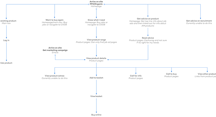
The recruiter site is a core part of the prospect journey. Users needed a clear understanding of the product offering, while returning customers needed easy purchase options.
Inside the business, several assumptions were circulating:
- We’re losing out to our competitors
- Users didn’t understand the variety of products we offered
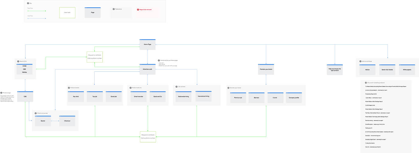
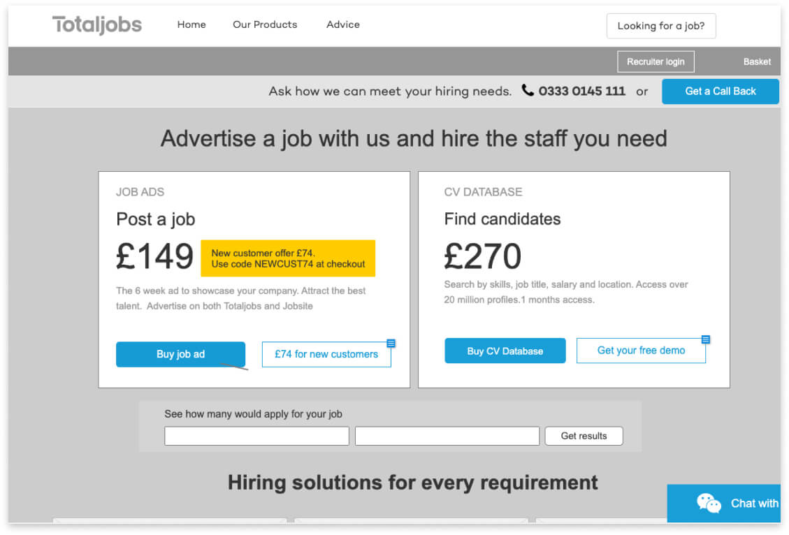
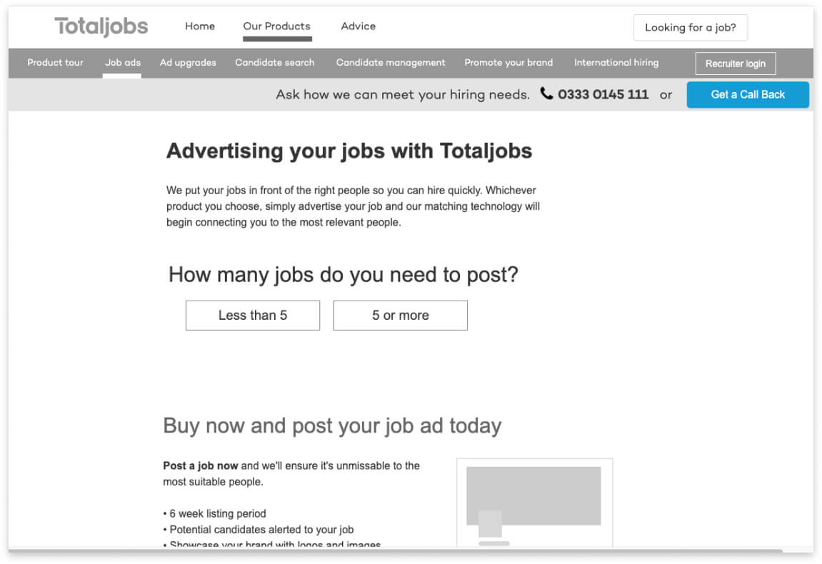
- Product discovery was difficult because everything was put under “Advertise a job” or “Find candidates” navigation items.
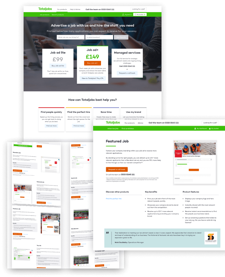
- Users didn’t know what our products looked like
- Users didn’t know what to expect from our products
Discovery and Research
Analytics
- Users bounced after clicking “Needs” and “Managed Services.”
- Talk to us box wasn’t getting any engagement. Those users who did click click
Surveys
- 54% didn’t understand the product offering.
- Many users didn’t know what the product looked like or what to results to expect.
Interviews
- Validated personas: Small business owners, HR professionals, recruiters.
- Find candidates mistaken for CV database login
- Confusing content, which used a lot of internal jargon
- Lack of clear, engaging product imagery.
Ideation and Design
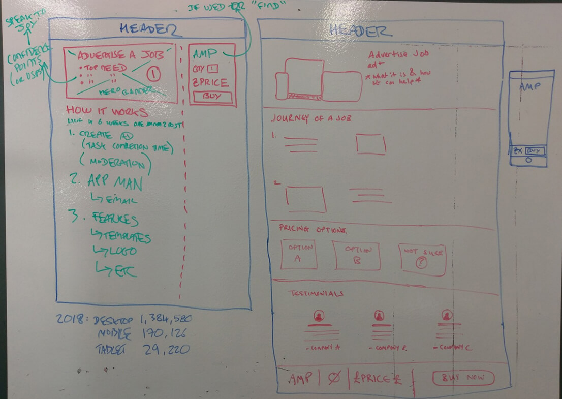
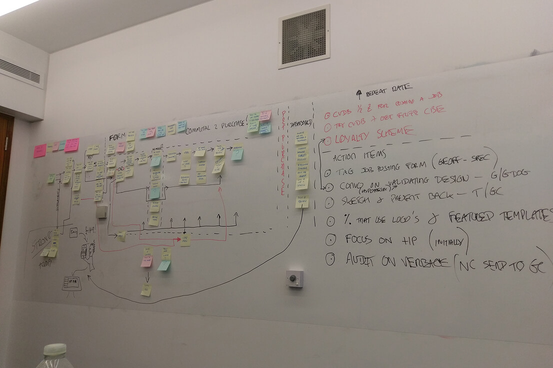
Armed with the dicovery insights I facilitated workshops with the Ecommerce Lead Generation team using Crazy 8s and dot voting. We aligned on a new Home page and product page IA and navigation.
- Digitised sketches into Axure wireframes.
- Proposed new taxonomy and product groups.
- Collaborated with stakeholders and content marketing to simplify messaging.
Usability Testing
I recruited participants and tested the low fidelity prototypes, focusing on the Home page, product pages content and navigation.
Findings
Experienced recruiters preferred calling or chatting with an account manager, using the site only for reassurance and product information.
Content was rated far clearer and easier to understand
All participants wanted more engaging product illustrations
Side-of-desk recruiters valued product detail pages more than others
5 Second Test
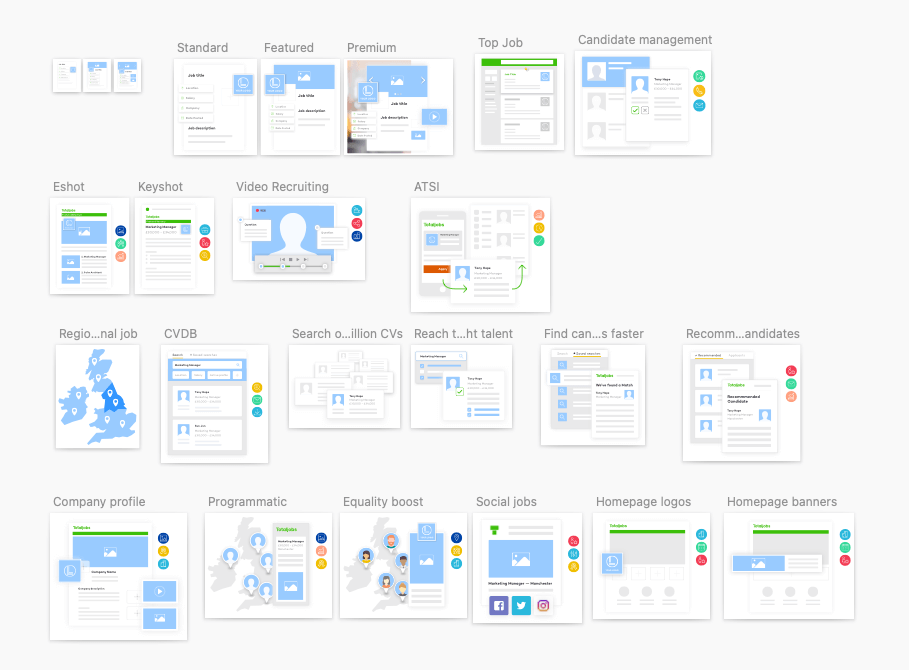
I partnered with the digital design team to redesign the product imagery and validated clarity through usability testing.
- Ran usability hub tests: users were shown images for 5 seconds, then asked what they represented.
- Results confirmed imagery needed simplification and clarity.
- After a few iterations we arrived at a direction and style of imagery that worked well.
The Solution
I recruited participants and tested the low fidelity prototypes, focusing on the Home page, product pages content and navigation.
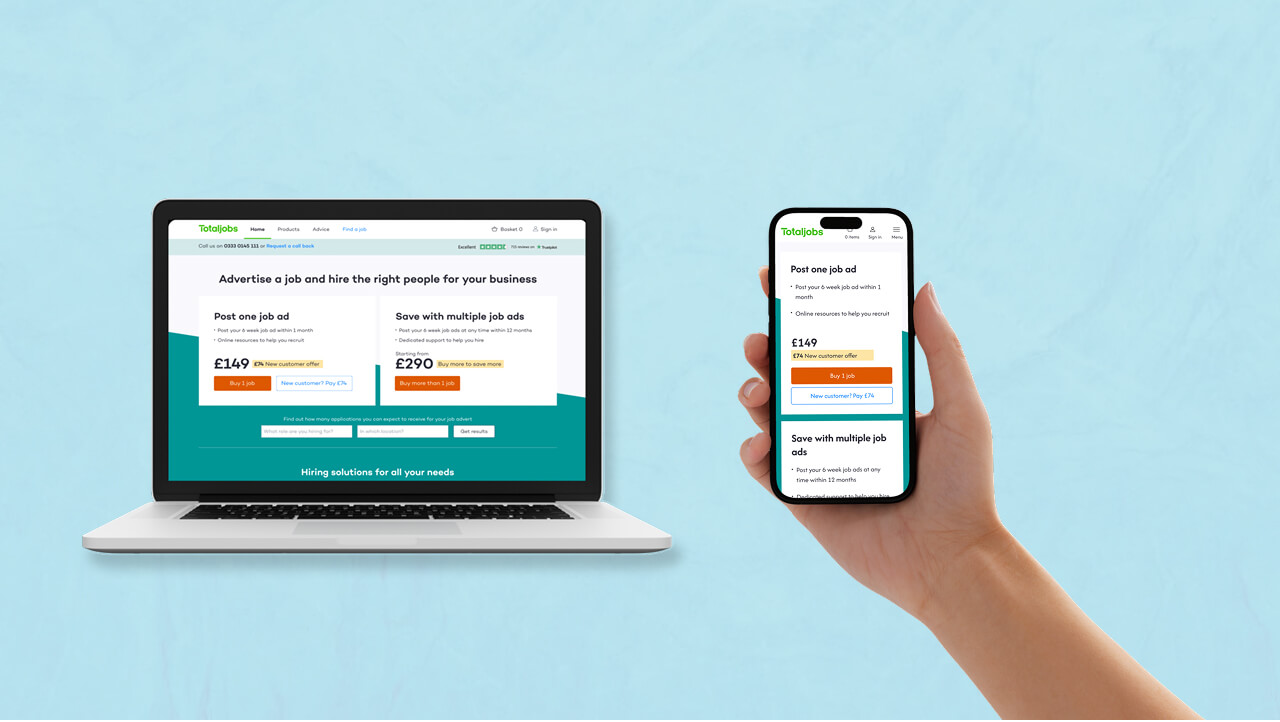
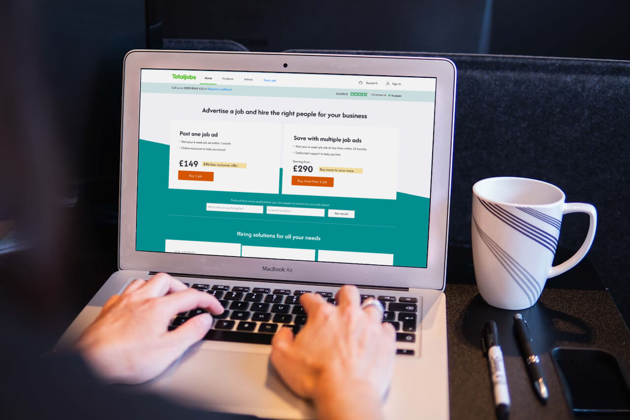
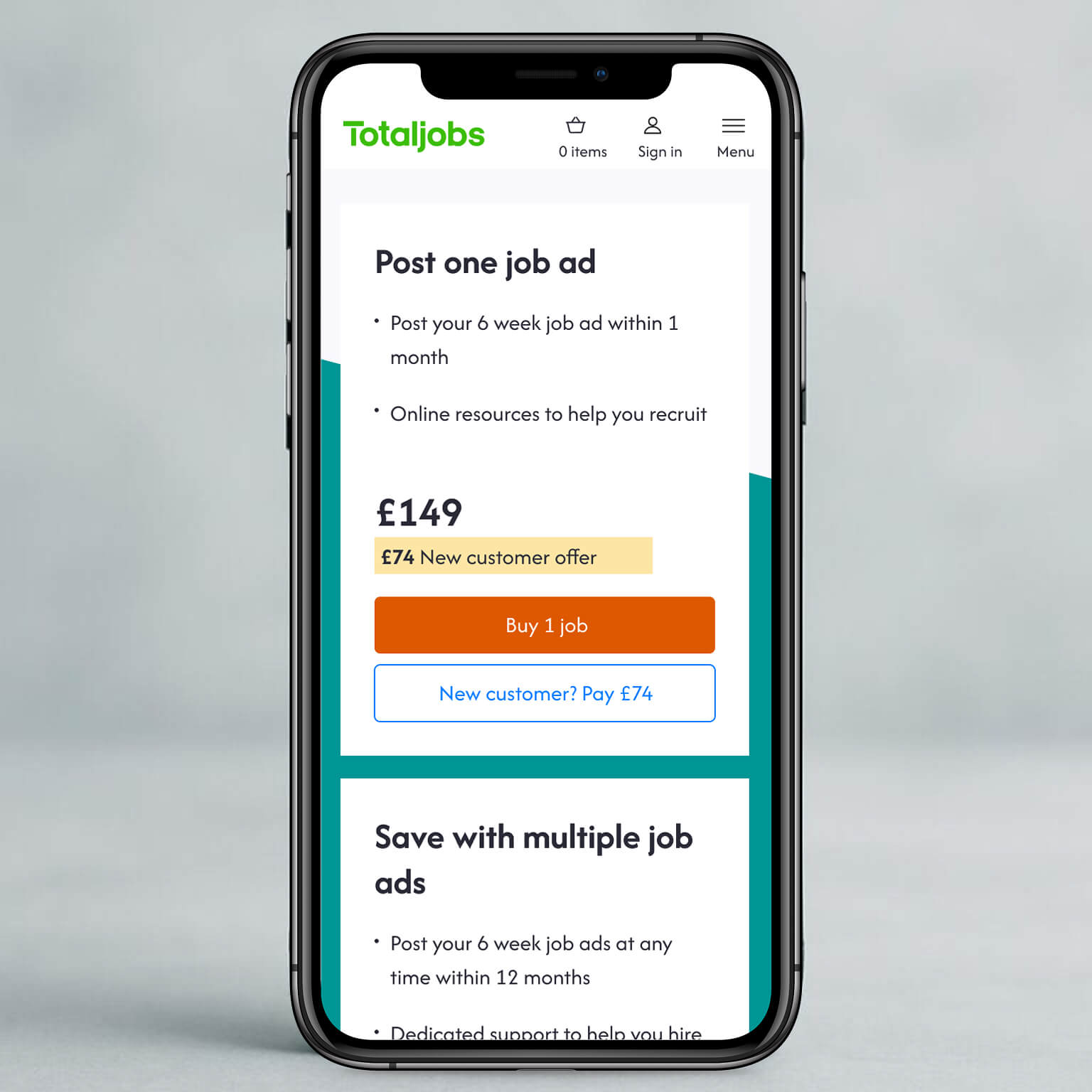
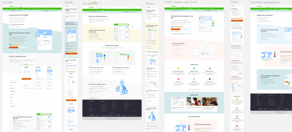
A clean home page with simplified taxonomy.
Conversion focused product pages with sticky bar.
Prominent Trustpilot reviews and phone number.
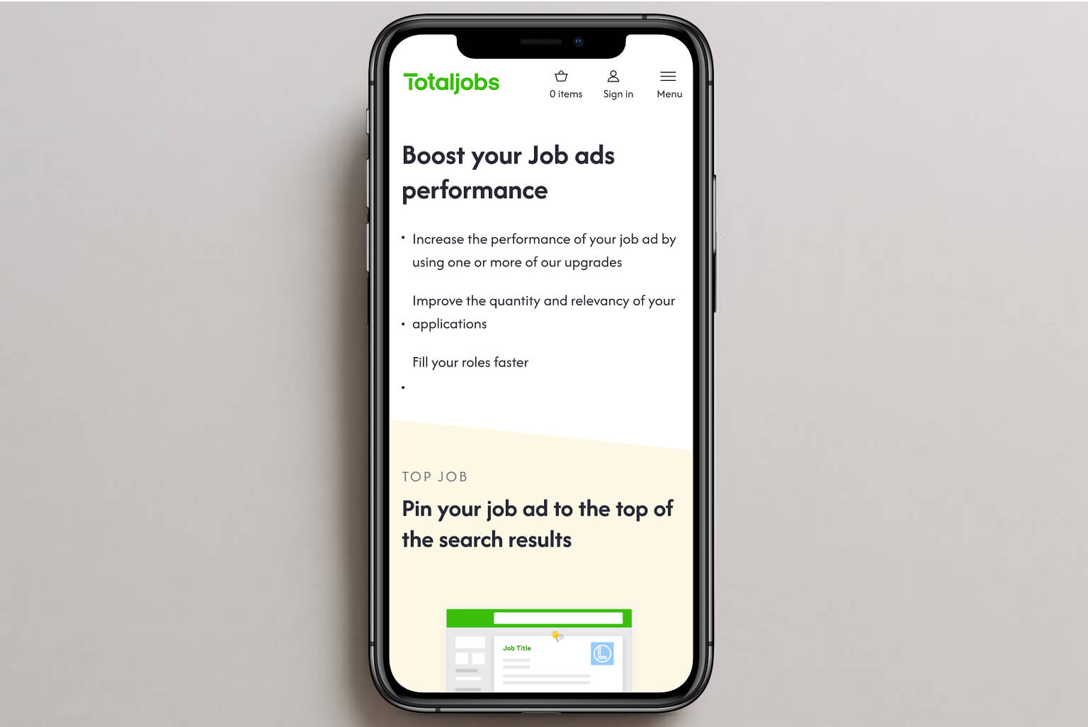
Refined copy and updated product imagery.
Impact
The redesign delivered measurable improvements:
+1.6%
Orders from homepage entry
+11.4%
Orders from product page entry
